How to make an animated CSS counter effect, no Javascript required
CSS3 has gained a lot of momentum in the last year or so, and much like my favourite Guava dipping sauce… it really goes with anything, adding a nice bit of extra spice to things that already taste good yet, could, perhaps, just taste that little bit better!
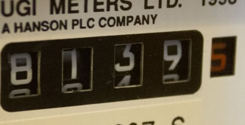
One effect I used on a recent project is the ability to make a scrolling css counter effect (requires Safari, Chrome or FireFox 5), I think it adds a nice bit of extra polish to the element without using any JavaScript. Take a look at the finished counter example, and get the code here.
Note: The counter created here is not a real-time thing, it is just an animated effect applied on top of a static number within the HTML. Of course, the number can be generated server side but there are no Ajax calls being made here to refresh the number.
The great thing about this effect is that, even if you can’t see the animation the numbers will still show in the correct position for browsers that don’t support CSS animation.
So, how does it work?
In a nutshell, each number is wrapped in a tag, with the background being set to an image that is essentially a strip of all the numbers (view the image here). We use CSS3 to simply animate the Y coordinate of the background image.
The HTML markup is very simple, but note that each number span requires its own class to apply the appropriate animation in CSS:
<div class="counter">
  <span class="digit-9">9</span>
  <span class="digit-3">3</span>
  <span class="digit-7">7</span>
  <span class="digit-5">5</span>
</div>
Now, lets animate these numbers! In our CSS we first apply some basic styling to each element:
.counter {
  float:left;
  padding:6px;
  border-radius:5px;
  background:#527F40;
}

.counter span {
  float:left;
  width:22px;
  height:30px;
  text-indent:-9999px;
  font-size:0.0001em;
  background-image:url(counter-sprite.png);
}
Now we have the basic skeleton of our counter applied, all we need to do is individually position each of the numbers and animate them appropriately. So, lets take the number 1 as our example. For this the code will be something like this:
.counter .digit-1 {
  background-position:0 -30px;
  animation-name: digitSpin1;
  animation-duration: 3s;
  animation-iteration-count: 1;
  -webkit-animation-name: digitSpin1;
  -webkit-animation-duration: 3s;
  -webkit-animation-iteration-count: 1;
  -moz-animation-name: digitSpin0;
  -moz-animation-duration: 3s;
  -moz-animation-iteration-count: 1;
}

@keyframes digitSpin1 {
  from { background-position:0 0; }
  to { background-position:0 -30px; }
}

@-webkit-keyframes digitSpin1 {
  from { background-position:0 0; }
  to { background-position:0 -30px; }
}

@-moz-keyframes digitSpin1 {
  from { background-position:0 0; }
  to { background-position:0 -30px; }
}
In this snippet we are declaring the @keyframes to tell the browser the start and ending position of our background image. We then reference the keyframes using its declared name digitSpin1 and then give it a duration of 3 seconds and to loop the animation once.
Now, you will have undoubtably noticed all of those vendor prefixes… They take up a lot of space in our code, and this is only for one digit! Once you have animated all 10 it definitely makes sense to use something like use something like Sass or .less to make our code easier to maintain.
Further experimentation
It can be great fun playing around with these kind of effects, just try chucking in a width attribute into the ending position, or even a CSS transformation (such as rotate)! It gives you a really good impression of just how powerful this stuff is, and ultimately, just how easy it will be in the future to achieve effects that we currently turn to JavaScript frameworks for.